
Page 1 of 192
Next
Get in touch...
You may find this useful….
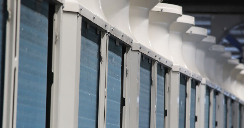
Mitsubishi Electric is a world-leading supplier of energy efficient equipment that will cool, heat, ventilate and control buildings.
We supply not only the equipment but continued support throughout the lifecycle of all products whether that is in commercial and industrial properties or homes.
Send a Sales Enquiry…...
You may find this useful….
Mitsubishi Electric has a vast product range that includes VRF air conditioning and chillers. Our Product Catalogue has our complete range of current products, including technical specification, so for more information please download this.
Check an Error Code Order a Spare Part
Or if you would like a simple overview of our product range and suitable applications, please download our Product Application infographic.
Send a Product Enquiry...
You may find this useful….
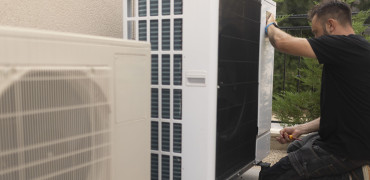
Mitsubishi Electric offers solutions that deliver the quality and excellence you would expect from a world-leading supplier. We can support you every step of the way whether pre-sales design and specification, installation and commissioning, or service and maintenance, right through to recycling.
For domestic heating service and maintenance, download our brochure below.
For commercial service and maintenance support download our brochure below, use the enquiry form on the right, or contact:
London and the South:
Midlands and Wales:
melserve.midlands@meuk.mee.com
North England and North Wales:
Scotland:
melserve.scotland@meuk.mee.com
National Enquiries Telephone: 01707 278650
National Email: melserve@meuk.mee.com
National Spares: 01707 278650 (Option 5)
Send a Service & Maintenance Sales Enquiry...
Request a call back...
Get in touch